Thursday, 30 July 2015

Happy birthday to Sue

My card today is another one I made a while ago when I was ignoring my blog.  I'm sure you'll be able to guess who this one was for.  


My photography skills are sadly lacking, and the photos really don't do justice to my card.   The base card was Pool Party, which I am coming to realise is one of my favourite go-to colours to use.  It's subtle, elegant, suitable for male and female and just the nicest shade of colour, in my opinion.  Not sure where the papers came from but it matched perfectly.  I did lots of sponging around the edges, including sponging the doily behind the name.  The chipboard letters were inked with two layers of white first and then two layers of Pool Party.  I then used VersaMark on top of that and heat embossed with clear layers and on the last layer added sprinkles of silver embossing powder to try to make it look a little ????? .... different.  Is patinaed the right word?  Rustic??  I'll think of it later.  I also did the butterfly the same way, and then added a couple of buttons as well.  

Tuesday, 28 July 2015

A sporty card


Wasn't it a beautiful weekend?  Lots of sunshine, perfect weather for working in the garden.  Roll on Spring. 

I had to make a birthday card a while ago for my great nephew who is sports mad, and as the sporting gene completely bypassed our family, I don't have any stamps remotely suitable for an 8 year old boy.  Fortunately I remembered I had the Honeycomb Embossing Folder, so set about making what I hope is a soccer ball.  I am sure Jack will tell me this looks nothing like a real soccer ball, but I'm helping him use his imagination.  The grass and sky were stamped using the "swipes" from Work of Art.  You can't really bling up an 8 year old boy card, but I did use lots of Glossy Accents on the number 8 to make it shine. 


Thursday, 23 July 2015

Blooming cards

These cards are also from the card class in April.  Earlier this year I discovered Stampin' Up's Natural White cardstock, only to have it retired in June.  This cardstock has an off white, slightly speckled handmade look, and gives cards a little more "vintagey" style.  The stamp set is one of the hostess sets  around in April, loaned to me by my stamping buddy.  

We stamped the flower on white cardstock and white heat embossed it, then sponged over the flower with daubers, trying for a little shading.  Background leaves were stamped onto the card and then coloured with a blending pen.  See the little inlet circle where the bow goes?  A trick I picked up from another demonstrator.  My card was in Rose Red, but others in the class chose to do their card in Perfect Plum.  


I think my favourite is actually the Plum colour.  What's yours? 

Tuesday, 21 July 2015

Bokeh

Have you had a try of the Bokeh technique yet?  It's actually quite a fun one to play around with and the variations are amazing.  Bokeh is actually Japanese in origin and it refers to blur or a blurry quality, particularly used in photography.  However, some very clever person has come up with a way to achieve it in cardmaking.  

First of all you need watercolour paper, which you wet slightly, and then you use either re-inkers or drops of colour from the inkpad to create the background - it's best to cover the whole sheet with ink.  After this is dry, you just sponge on white ink using a pre-cut template with different size circles.  It looks better if some of these circles overlap each other, and also good to have some circles darker than others.   These are some of the cards made at a card class back in April.  


As you can see, all turned out completely different.  See how you go with yours.

Thursday, 16 July 2015

More sprinkles

Last week I showed you a card make using the Sprinkles of Life stamp set.  I'm sure you've seen so many cards made using this set with the cupcakes, cakes, baskets and trees, but here's a different one.  And I am pleased to say I thought of this one all on my own.  

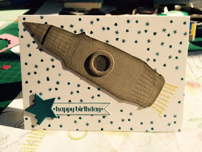
To me, the icecream cone looked like a rocket nose and so that's how this card started.  I used the cone twice for the nose cone of the rocket, and then the basket for the end of the rocket.  I also attached another pointy bit for the front, added a window and then used the basket again (masked) as the flames.  I then stuffed up the background with too many stars, but overall I was pleased with the way it turned out.  If you plan on copying my idea, you will need to draw in the shape between the nose and the base.  I used a marker and then sponged the edges, but you'll figure out what works best for you.


So, now you have another reason to buy Sprinkles of Life, and help support Ronald McDonald House at the same time. 

Tuesday, 14 July 2015

Bows and stars

Hope you are all enjoying the cold weather - I'm not.  Although it is currently lovely and sunny in my room, and warm.  Won't be in a couple of hours though when the sun has gone down.  

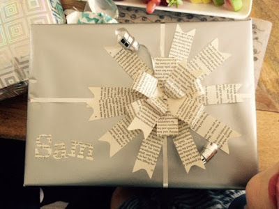
My creative side has been sidetracked lately with other things interfering, but hopefully soon I will have a day to myself to do what I want.  On the weekend we went to a birthday party for my nephew, and for his present, we went in with my sister-in-law.  So Kylie sorted out all the wrapping and look at the lovely bow on his present.  It's made from a discarded library book.  Just had to share this with you.  


The card I made was from an idea by Lynda Shrimpton, a fellow demonstrator who posted her card on an online forum.  Lynda had used a stamp around the edges of the star, but as I don't have that stamp, I paper pierced mine instead.  The first card is using the same colours she did, and the second card, the one Sam received, I just made the darker green  the predominant colour.  I am sure I will be making a few more cards like this in the future.  This was very easy to do, and uses up some of those scraps of cardstock you have hanging around.  Thanks Lynda.


Thursday, 9 July 2015

Let's be Awesome

To be honest, when I got my first looked at the new Stampin' Up catalogue I have to say I was a little disappointed with the new sets.  There were only a few new ones that I really thought I "needed" and Awesomely Artistic was one of those.  But after having a few weeks to look more carefully I now have a wish list with a few more (OK, a lot more) that I need.  I think Pinterest has also helped change my mind - there are some really talented people out there who do really beautiful work.  So, if you are like me who on first glance felt a little discouraged, google the set in Pinterest and see what you think after that.  I just needed a little inspiration and maybe you do too.  


Back to our cards.  This first card is my version of one I made in a class with a fellow demonstrator.  Michelle always makes beautiful cards, so I copied a lot of her ideas for this one.  The cardstock is Tip Top Taupe, my current favourite, and the card has lots of sponging with a few different layers, and also twine and sparkles.  

And our last card used the same stamp set but this time with a bit of colouring.  I'm a fan of black and white cards with a splash of colour, so I chose a black base for my card with a white inside.  The black had a square window cut into the front and the white inside was folded into fours with one quarter removed.  Only the back panel is attached to the card and the black cut out shape is attached to the front of the white through the hole.  I added a ribbon tab to the right of the squares so this can be held when opening the card.   My jumbled instructions are probably easier to work out from the photo.  Our flowers have been white heat embossed and coloured with markers.  


Tuesday, 7 July 2015

I'm still around

Well, I did intend to have a little break from posting, but I didn't realise it had been this long.  What have I been up to since I last posted?  Not a lot really.  Our backyard is still a bit of a work in progress.  I'll post a photo at some stage, but as I'm sitting at the computer, I had better stay here before I get distracted by something, .... anything.  We have also had a week away in Tea Gardens in April and my daughter turned 21.  And as this is a Stampin' Up related blog, I should also mention that my friend and I also went to the SU Convention on the Gold Coast in May where we saw lots of new products and how to use them, got our hands on the new catalogue before lots of other and also experienced nature at its best and worst over the course of the weekend.  Apart from that, life just rolls along.  

I have had two card days here in the past few months, but I'll show you what we got up to last Saturday first as these photos are all ready to go.  

One of the sets in our new catalogue is called Sprinkles of Life.  This set has 22 different stamps to use and there's also a punch to help with cutting out.  The best part about this set is that $3 from every set sold is donated to Ronald McDonald House, so you can stamp till your heart's content, and also help support a charity at the same time.  Now that's a plus.  

So, of course this set had to be one we used, and here's my card.  


Everyone loves icecream, so nothing better than a triple layer cone would do.  Each layer has been stamped in VersaMark, heat embossed in white and then cut or punched out (there is no punch for the basket or cone) and then sponged lightly around the edges with the corresponding ink.  A bit of sparkle also around the outline and a pearl on top.

This next card has a circle cut from the front panel so one of the little branches comes through with two little birds sitting peacefully together.  Lots of paper piercing around the edge of the circle and in the corners of the front mat.


And did you notice the new cardstock.  These are two from our latest set of In colours; Watermelon Wonder and Mint Macaron.  The other three colours are Cucumber Crush (a bright green), Delightful Dijon (a mustardy colour which some call baby poo) and my favourite, Tip Top Taupe, which you will see if you pop back again.  Don't you love their names?  I wonder who the lucky person is that gets to name all the new colours.  I'd love to know what qualifications you need for that job.