Tuesday, 26 August 2014

A few more

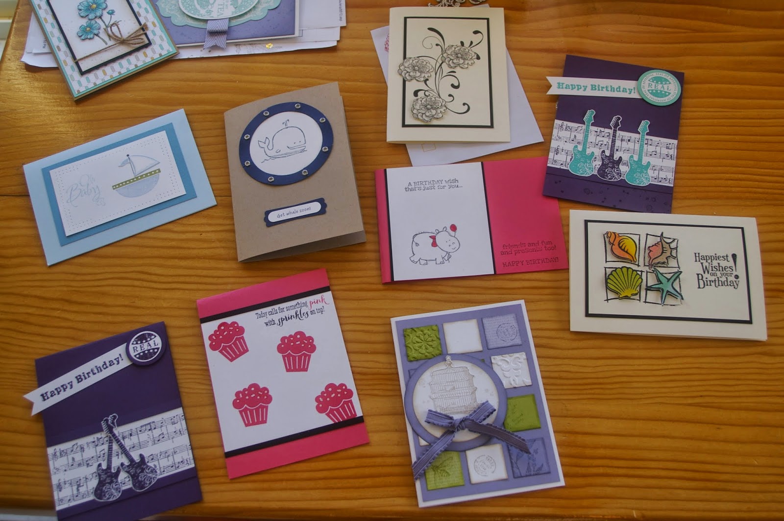
I have been very fortunate lately that I have been able to sell some of my cards off to people whom I work with.  I love making cards, trying new techniques and just stamping, so when my stash of cards threatened to overflow from the box this was one way to make sure someone else got to enjoy(?) my creations as well.  

Here's a few already to be taken into work to hopefully find a new home. 


 The sprinkles in this card were all coloured with KindyGlitz for a sparkly finish.


This one was an old Stamp It stamp that I found in the cupboard when I was looking for my beachy male card a while back.  The images were all stamped  on the cardstock and then stamped again and embossed and sponged with daubers.  These were then cut out and popped up on top.  This one would have to be one of my favourite cards from this bundle.  But that exclamation mark on the greeting has to go!!
 

And I'm off to another one of Michelle's card classes today so pop back again soon to view her Christmas creations.

Thursday, 21 August 2014

Apothecary Wedding

 Time for another wedding card.  My card uses some old textured Wisteria Wonder cardstock that I hope I never run out of and Apothecary Art stamps.  Piercing the little holes all the way around the frame does take a little while, but it adds so much to a card that it's time well spent.  Have tried to sew along the cardstock but my machines leaves a few extra marks that I don't really appreciate. 


Forgot to take a photo of the inside, but it did look good.  You will just have to trust me!

Tuesday, 19 August 2014

Another oldie, but a keeper

Grunge Rock is another one of my favourite stamp sets that I cannot bear to part with.  I've combined it on this card with a Kaisercraft stamp - Sheet Music.  Not sure that the "splodges" go with the card, but I was happy with the rest.  This is one of those cards that the colours looked much better in real life. 


Thursday, 14 August 2014

Wedding Hearts

I was recently asked to make a wedding card for a non traditional couple who were to be married on a beach in some exotic tropical location, so I chose Coastal Cabana as the contrast colour to white as it reminded me of warm sunny beaches.   

I made a three fold card and stamped and cut out all the heart shapes to sit on the edge of the diagonal.  And then I had to cut identical ones for the reverse side which would be seen when the card opened up.  Lots of cutting and gluing. To keep the card together I had to tie a ribbon around which they could slide on and off.


Note to self - next time make sure the hearts on the joining folds are the smallest so the ones behind can be seen better.

Tuesday, 12 August 2014

Owl birthday


I am not sure about this card.  I think it's a little too much, but I love the owl. The banners and greeting are from Amazing Birthday and after I had stamped and placed them on the white background it looked a little ... pale?  So I pulled out some Glad Wrap and gave the background a little colour, but maybe it was too much or too dark.  Nevertheless, I am sure the person who received it got the message.     


Thursday, 7 August 2014

Inspiration 2

These are the last two cards we made at Michelle's Sadly the background stamp used in this first card is now retired and I can't even remember its name, but the top stamp is called Tea Party.  Think this card was my favourite, but it was hard to pick out of the four.       


And the last card was a little note card that used some Washi tape and a single stamp called Bloom for New, another new one in the catalogue.  I have looked at this one and decided I didn't like it/need it, but maybe ....  We stamped the centre bits separately and then mounted then together. 


Tuesday, 5 August 2014

Inspiration Class

Remember when I said I hadn't been making many cards lately because of lack of inspiration and I was planning on going to another Demonstrator's class?  Well these next four cards are the ones we made at her place.  

This first card was made using one of the Hostess stamp sets called Bloom with Hope.  And Michelle gave us a lesson on how to use the Blendabilities to their best effect.  I'm still working on my technique, but I think this card looks pretty good.  And the best part about going to a class is that everything is all cut out for you.  No cutting and measuring ... just stick together.  All the hard work has already been done. 


This second card uses the Perfect Peacock stamp, one that is usually used for colouring with Blendabilities.  Fortunately we didn't have to colour this one, merely sponge the edges and stick on lots of gold sequins.  


Thursday, 31 July 2014

Too Kind 2

After all the time it took to create my first Too Kind card, I decided to make a few more in different colours.   Below is the first card I made using two different coloured inks, but for the other two I used the same ink pad, just stamping off and using the second generation ink as the contrast colour. 


   Think I like the mauve coloured one best.  How about you? 

Tuesday, 29 July 2014

Just a touch of sparkle

My 9 year old great niece celebrated her birthday earlier in the month and I realise I have not shown you her card. 

I made it all sparkly with silver glitter paper and silver embossing powder on the inside.  I made it a centre opening card, which I don't attempt very often as I can never usually get both sides to line up perfectly, and it bothers me.  But this one worked pretty well.


Thursday, 24 July 2014

"Beachy" male card?

I was recently asked by a friend if I could make a birthday card for her husband's 50th birthday.  Of course I would love to, who doesn't love having a project.  When questioned about her husband's interests, the answer was that he loves anything to do with the beach.  

Dilemma - as I don't really have anything beachy.  The Open Sea is nautical, but I wouldn't call it beachy.  However I am very fortunate that she loved the card, and she was sure her husband would too.  


You may think you have seen something like this before on here, and you would be right.  Sometimes you just have to go with what works. 


Tuesday, 22 July 2014

Too Kind

I seem to have lost my mojo at the moment.  I sit in my room and look at some of the new things I have to play with, but just don't seem to create anything.  I am off to a class tomorrow with another demonstrator, so hopefully she will inspire me to do something.  

This little note card has been in the works for about a week now.  I stop and start, leave it for a day or two, get an idea and then .....  But it is now finished.  And I am quite pleased with how it looks too.  


Too Kind is a two step set, which means that you stamp one image and then there is a shadow or highlight stamp which goes over the top.  Sometimes these are stamped in the same colour using the "stamp off" technique so you get the second generation image with less colour, or sometimes you use a completely different shade of ink.  On this card I used Calypso Coral and Crisp Cantaloupe for the two two effect.  I found a little tag shape in the pile of scraps so used this and a little Baker's twine.  Nice.  


Thursday, 17 July 2014

Another Little Letters

Did you notice the other cards on the board on Tuesday's post pictured below? 


Here's my very quick version of the "happy birthday" card. 


We had been out to Bunnings in the morning and I had grabbed a couple of paint card samplers to try on another project, so as I couldn't be bother rifling through the paper packs in the cupboard I just used these.  No where near as effective as the ones from Convention, but at least I had the spacing relatively even.  I should have kept all the little circles from the B, R, D and A letters to make it look better.  Next time. 

Tuesday, 15 July 2014

New stuff

Finally, we have new things.  A lovely big box arrived last week with lots of new things to play with.  Now I just have to find some inspiration.

One of the products in our new catalogue I had to have was the Little Letter Thinlits.  While at Convention in Melbourne, one of the demonstrations was using these alphabet dies in a slightly different way, or at least one that I had never seen before, with the letters on the top side of the card.  


That shouldn't be too hard, you think?    Actually you're right, it's not hard, just fiddly.  Here's my first attempt - be kind. 


 And the back of the card ....


Could you guess who the card was for?  Thankfully I only had to worry about three letters.  As I said, it's a little tricky but quite effective.  I think I would try to hide the reverse side next time though.  

We had a birthday lunch for Sam at Homebush Olympic Park and the letters actually got a little squashed before they arrived.  Of course the card doesn't fit in a standard envelope so I chopped the top fold off to transport the card, but it needed more protection.  

And the card was another spinner card where the space ship was supposed to spin around the planet.  Sometimes worked, sometimes didn't.   


Friday, 11 July 2014

Petal Parade set

Today a set of cards using one of the Sale-a-bration sets - Petal Parade.  This was another one cased from someone on Pinterest, but I am sorry, I can't remember who and where I found it.  If it's your original design, thank you.  I do try to credit people when I can.   


Lots of lovely bright colours, and a splash of bling.  What more do you need?

Wednesday, 9 July 2014

Inspired by "Frozen"

While I'm waiting patiently (??) for my box of new goodies to be delivered you will have to be content looking at some cards made using older products.  

This card was cased from Michelle Le Breton, another Stampin' Up demonstrator who was inspired to make this card while watching the movie "Frozen".  I still haven't seen it yet, but I loved her card.  So I made it in blue similar to hers, and then Melon Mambo just for something different. 


Thursday, 3 July 2014

Apothecary Art

Have been spending a lot of time in my craft room lately, mostly because it gets the sun during the day and tends to be a little warmer than most other rooms, but also because I have been trying to sort through things to see what needs to be filed, thrown out or put away.  It has taken a while, mostly because I get sidetracked all the time, but it's almost done.  I've also sorted through my stamp sets to see which ones are no longer current and it seems to be half the shelf.  Bit sad really, but there are some that are definitely keepers no matter what.  

I have been making cards lately to try to sell at work and have been using sets that haven't been played with much lately.  Today I have a couple of cards made with Apothecary Art.  It's so great that we have framelits to match stamps, so much easier than cutting. 


Tuesday, 1 July 2014

New Catalogue

1st July - Know what that means?  It means that today is the first day we can buy products from our new Stampin' Up catalogue.  And know what that means?  That our bank balance will be a lot less than it was yesterday.  Sad, but true.  There are so many great things that I NEED, and not just new stamps.  There are alphabet framelits, new punches, beautiful ribbons, ......  

So, another card using one of those new sets you may NEED too.  This card is CASED from one I loved by Ann Schach. The new Traveler stamp set is a great one for males, and also for bon voyage cards or just someone who loves trains, ships, cameras or vintage.  All the images have really fine detail and stamp great.  In the set there is also a globe map, cruise ship and suitcase.